What is letterhead? Secrets of beautiful Letterhead design 2021
Today, Letterhead is often invested by businesses to increase the unique identity of the brand in the hearts of customers. So what is Letterhead? How to build an effective Letterhead? To answer that question, let's find out with Tino Group right below!

Letterhead Overview
What is letterhead?
Letterhead is also known as letterhead . This is a publication that records the basic information of a business such as: logo, brand name, address, business email , phone number, etc. Using Letterhead will increase the brand recognition of the business. when sending letters, documents, quotes or product introduction information to customers.
READ ALSO
Instructions on how to run effective Shopee ads
Instructions on how to post photos and videos at the same time on Facebook
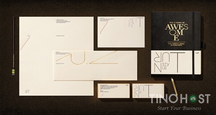
The uniqueness of the Letterhead design will exude the care, respect and professionalism that the business has for its customers. As a result, customers' impression of the brand will be favorable, contributing to building the brand's position in the market. Currently, Letterhead is very well invested by businesses, because it will represent the professionalism of the brand to customers or partners.
How is letterhead used?
In each business, Letterhead is designed differently and used for specific purposes, namely:
Making invoices and letters to customers/partners
As a cover letter for aspiring employees
For internal communication between departments in the company
Record meeting minutes
Use for business website
Benefits of Letterhead in business
For businesses, the most important printing asset value cannot be ignored. Because, on Letterhead will fully and clearly show the logo, contact information and other detailed content of a company. Each unit will own a different Letterhead design, a brand identity network with customers.
Representing a legal document of the business
This is the strong reason why businesses often use Letterhead in all their correspondence. Because it is considered as a legal document of the business. People choose Letterhead as the image representing the entire brand in indirect contact with customers.
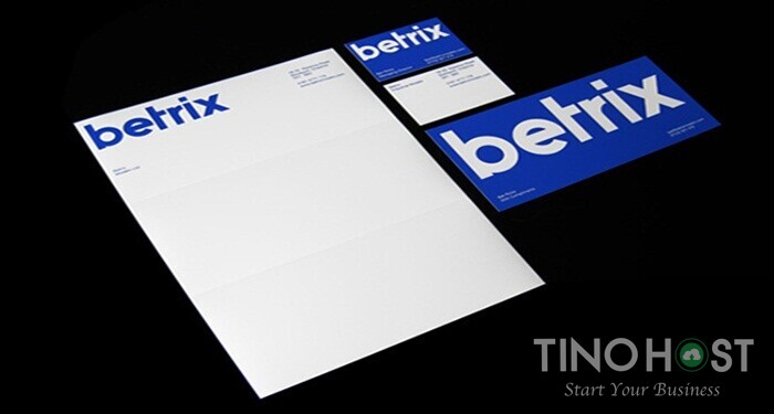
Show professionalism
Letterhead is considered a representative of the company, a measure that determines the position of the company in the market as well as in the minds of customers. How is the capacity of the business, how is the coverage, can it be suitable for the needs and reliable to use, .. These things have pushed businesses whether large or small to prioritize first. Investing in Letterhead as well as personalizing professionalism with customers through the use of Letterhead.
Is the representative image of the company to the public
In addition to legal representation, Letterhead also plays a role in increasing the brand recognition of the business in the eyes of consumers. Because, the user's psychology is often attracted by beautiful, unique, and thoughtful things. An impressive title, leaving an aftertaste in the customer will easily convince them to take action, continue to receive information from you. That is why Letterhead is considered a useful value for every business.
Once you have designed the Letterhead, you should create a very thorough, sophisticated, professional Letterhead template before handing it over to the customer. Your carelessness and sloppiness shown in Letterhead will inadvertently make your brand lose points in the hearts of customers.
It is a powerful marketing tool for businesses
On Letterhead will display full official information about the business. Besides the purpose of providing information, they also help businesses build trust and peace of mind in the hearts of customers.
Therefore, Letterhead is considered a fairly popular and effective form of marketing applied by the majority of businesses to attract potential customers and increase company profits.
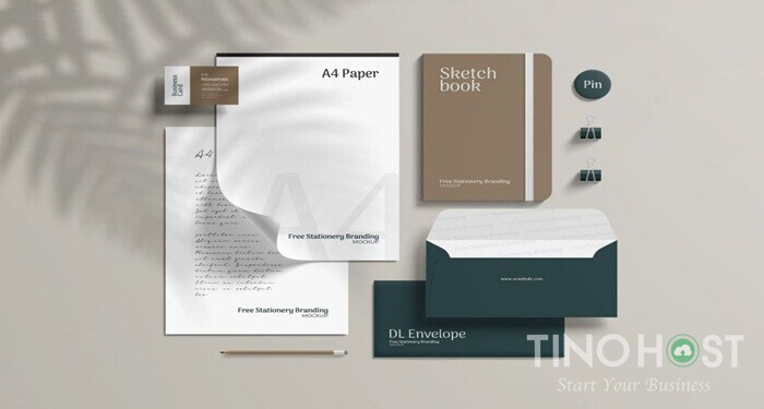
Secrets of beautiful Letterhead design 2021
Learn about Letterhead's standard layout
Letterhead is the invisible wire connecting customers and businesses. Therefore, the letterhead of the business needs a thorough investment, creating attraction. However, you should not be too principled, because you want to stand out and use dry shapes and flashy colors in Letterhead.
The "attractive" factor here is the power to attract customers from the moment of opening the envelope to reading the content of the letter. If you focus on designing an eye-catching appearance, customers will focus on the border and forget the information in the middle of the paper. This bad thing happens will make your company not achieve the purpose of conveying information to customers.
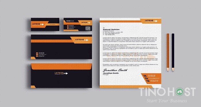
Usually, businesses tend to use Letterheads designed from cubes, or more simply, use borders around them. Moreover, each different field and industry will have ways to build a Letterhead layout in accordance with the characteristics of the industry.
For example: For companies in the field of education or law, their Letterhead focuses on simple but sophisticated design, without using disruptive and rebellious layouts.
Color selection for Letterhead
Choosing colors in a design that is both harmonious and impressive has never been easy, especially when designing with Letterhead becomes even more difficult.
Color will largely dominate the overall picture of Letterhead. When designing Letterhead, you should stick to two standards: make sure there are main colors similar to the brand identity, all colors must surround and highlight the white part to fill in.
Besides, the Designer should avoid using too many colors on the same Letterhead sheet. This can distract customers from focusing on information, reducing the color of brand identity
Highlight your brand in Letterhead
When designing Letterhead, businesses need to prioritize to highlight the brand.
Logos and brand names are usually placed at the top or bottom of the right side of the paper, and Letterhead needs a Watermark to mark. The watermark setpoint is often blurred in the middle to increase brand recognition, identify copyright as well as highlight the brand of the business. This also helps customers remember your brand more than keeping information on paper.
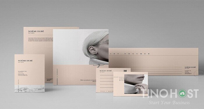
Choose a fixed and suitable Font
When designing Letterhead, the above parts are often very small and a little hard to see. Therefore, you need to choose the fonts used in Letterhead that are clear, coherent and fixed fonts, avoid curving typefaces, bold strokes. Usually, businesses will choose basic fonts such as Roboto, Helvetica, ...
Mix a little creativity and difference
Simple and sophisticated Letterhead templates are always the top priority of large businesses. However, in order to create new trends and stimulate the interest of viewers, Letterhead should have a more unique and innovative design, especially for the information technology, fashion or agencies industries.
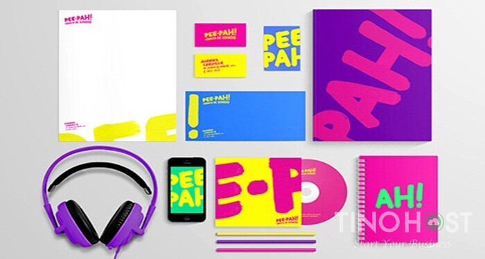
In addition to the style, the color and the innovative layout also represent the very subtle, future-oriented innovation of startups. However, a little unique and creative blend should be restrained, avoiding abuse will make Letterhead become messy, less valuable. And fields like Law, Finance, Education should not design Letterhead too rebellious.
Learn about Letterhead sizing and printing
The size of the paper size in each country in the world will be different. The fact that you default Letterhead to be printed on A4 paper will sometimes not meet the needs of customers. For example, in Vietnam and most Asian countries, the Letterhead size is 210 x 297mm, but in the US it will be printed on 215 x 297.4 mm paper.
Capturing customer information to customize the size will make your Letterhead more professional and effective.
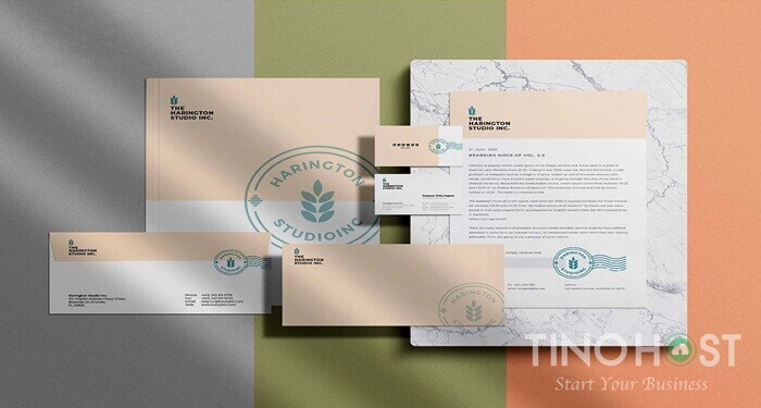
Most Letterheads are usually printed by office printers.
However, the main disadvantage of this type of printer is that the color quality on the finished product is reduced, colorful and vibrant colors, neon, ombre, etc. cannot be printed. Or the use of an office printer will not scan all the large color arrays, leaving tiny pixels that look unsightly and unprofessional. Therefore, you can choose to print outside a large number of Letterhead. Or design the Letterhead with monochrome colors, small patches of color.
Above are the sharing of Letterhead as well as tips for beautiful and effective Letterhead design. You know, using Letterhead in marketing is increasingly popular and necessary in businesses. Hopefully, the above information will help you to have your own impressive Letterhead design ideas to send to customers.
FAQs about Letterhead
Letterhead design principles
Simple, eye-catching design
Ensure scientific and coherent information distribution
Outstanding brand image
The most standard size when printing Letterhead
Letterheads are usually printed in bulk. Therefore, to ensure the most effective printing process, people often choose offset printing technology. The commonly selected paper size is A5 paper with a standard size of 210 x 297 mm. Depending on the needs and options of the customer, you can choose a larger size.
What to keep in mind when printing Letterhead?
Choose to print in bulk, the unit price per sheet will be reduced
Should design from 2-3 basic tones, do not use too many colors will confuse the viewer's eyes
The color difference when printing on the machine is about 5-10%
To print the correct color, you should convert the file from the RGB color system to the CMYK . color system